Currently Empty: £0.00


Course Description:
In today’s digital landscape, creating websites that offer a seamless experience across all devices is crucial. The Responsive Web Design course on OxfordLumina is designed to teach you the essential techniques to build websites that are flexible, adaptive, and visually appealing on any screen size. Whether you are a beginner looking to dive into web design or a developer aiming to improve your skills, this course will guide you through the core concepts of responsive web design, from layout structures to fluid grids, media queries, and modern frameworks.
Throughout the course, you will work on real-life projects, applying responsive design techniques to ensure your websites are accessible and optimized for any device, from desktops to mobile phones. With step-by-step instructions and hands-on exercises, this course will equip you with the tools and best practices needed to design modern, user-friendly websites.
Course Modules:
1. Introduction to Responsive Web Design
- Understanding the importance of responsive design in the modern web
- Overview of web design principles and mobile-first design
- Key differences between traditional web design and responsive web design
- Exploring user needs and how responsive design improves user experience
2. Core Principles of Responsive Web Design
- Fluid grids and flexible layout systems
- The role of viewport and meta tags in responsive design
- Media queries: tailoring CSS for different screen sizes
- Introduction to the mobile-first approach
3. Fluid Layouts and Flexible Images
- Designing flexible layouts using percentages instead of fixed widths
- Working with flexible images and scaling them responsively
- Handling images across various screen sizes and resolutions
- Practical Exercise: Build a responsive layout using fluid grids
4. Media Queries and Breakpoints
- Understanding media queries and how they control responsive behavior
- Setting breakpoints for various devices (smartphones, tablets, desktops)
- Advanced media queries: targeting different screen resolutions and orientations
- Hands-On Project: Implement media queries for a sample website
5. Designing for Mobile First
- Mobile-first design philosophy and its benefits for user experience
- CSS techniques for building mobile-first websites
- Adapting web design for smaller screens and scaling up to larger devices
- Practical Application: Convert a static design into a mobile-first responsive website
6. Responsive Typography and Scalable UI Elements
- Using relative units like em, rem, and vw for scalable text and UI elements
- Best practices for responsive typography: font size, line height, and spacing
- Designing user interface elements that adjust to screen sizes
- Exercise: Optimize typography and UI elements for different devices
7. Advanced Responsive Techniques with Flexbox
- Understanding Flexbox for building responsive layouts
- Creating flexible grids and complex layouts using Flexbox
- Aligning and distributing items within responsive containers
- Practical Application: Build a complex responsive layout using Flexbox
8. Working with CSS Grid for Responsive Layouts
- Introduction to CSS Grid and its advantages for responsive web design
- Designing complex, grid-based layouts that adapt to different screen sizes
- Combining Flexbox and CSS Grid for modern responsive designs
- Hands-On Project: Build a responsive web page using CSS Grid
9. Responsive Navigation and Interactivity
- Designing navigation menus that work on all devices (hamburger menus, dropdowns, etc.)
- Building interactive elements (forms, buttons, carousels) that are touch-friendly
- Handling user interactions on mobile devices (hover vs. touch events)
- Practical Exercise: Create a responsive navigation system for a website
10. Testing and Optimizing Responsive Web Design
- Tools and techniques for testing responsive websites across devices and browsers
- Troubleshooting common responsive design issues (alignment, spacing, font scaling)
- Optimizing websites for performance: load time and mobile optimization
- Final Project: Test and optimize a responsive website
11. Frameworks and Tools for Responsive Design
- Introduction to responsive design frameworks: Bootstrap, Foundation, and others
- Pros and cons of using frameworks for responsive design
- Customizing and extending frameworks for unique projects
- Practical Application: Use a framework to build a responsive web page
12. Implementing Responsive Design with Best Practices
- Best practices for maintaining a responsive website in production
- SEO and accessibility considerations for responsive websites
- Optimizing user experience across various devices (mobile, tablet, desktop)
- Hands-On Exercise: Implement best practices in a real-world project
13. Capstone Project: Build a Fully Responsive Website
- Apply everything you’ve learned to design and develop a fully responsive website
- Implement fluid layouts, media queries, Flexbox, and CSS Grid in your design
- Optimize the website for mobile-first and ensure seamless user experience
- Present your project to peers and instructors for feedback and review
Key Features:
- Comprehensive Learning: Cover all aspects of responsive web design, from fundamentals to advanced techniques.
- Hands-On Projects: Work on real-world assignments to build responsive websites.
- Interactive Content: Get access to interactive lessons, quizzes, and live coding examples.
- Expert Instructors: Learn from web design professionals and industry experts.
- Certification: Receive a certificate of completion to validate your responsive web design skills.
- Lifetime Access: Access course materials and updates for continued learning.
Who Should Enroll:
- Beginners in web design looking to learn responsive techniques
- Front-end developers seeking to improve their responsive design skills
- Designers interested in creating user-friendly, adaptable websites
- Anyone who wants to create websites that work seamlessly across all devices
Learning Outcomes:
By the end of this course, participants will:
- Understand the principles of responsive web design and mobile-first development.
- Be able to create fluid layouts, use media queries, and design for different screen sizes.
- Have experience building responsive websites using Flexbox and CSS Grid.
- Gain expertise in creating navigation systems and interactive elements for mobile devices.
- Be able to test, optimize, and troubleshoot responsive websites effectively.
Join the Responsive Web Design course at OxfordLumina and learn how to design modern websites that provide exceptional user experiences across any device! Gain the skills to make your websites mobile-friendly, adaptive, and optimized for today’s digital world.
Courses You May Like

Arts & Design (Tech Focused)
(0.0/ 0 Rating)
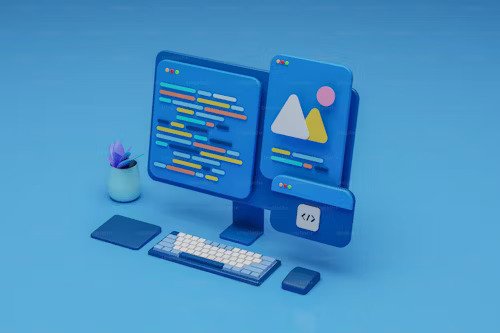
Introduction to Web Design and Development
€100.00
- 0 Lessons
- 300 Students

Arts & Design (Tech Focused)
(0.0/ 0 Rating)
Design Thinking for Innovation
€110.00
- 0 Lessons
- 160 Students
Arts & Design (Tech Focused)
(0.0/ 0 Rating)
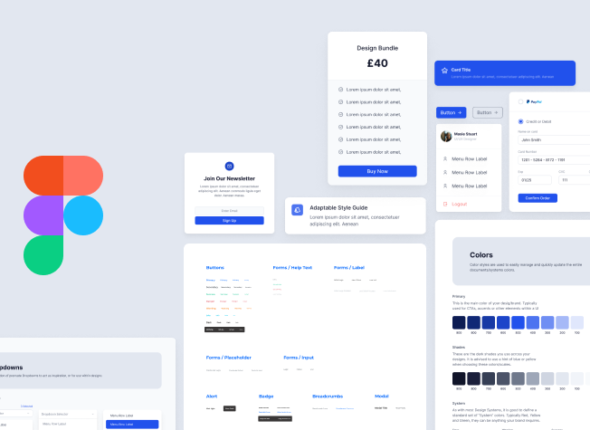
User Interface Design with Figma
€70.00
- 0 Lessons
- 451 Students
Arts & Design (Tech Focused)
(0.0/ 0 Rating)
Creative Coding for Designers
€90.00
- 0 Lessons
- 451 Students